Colour does more in a bedroom than most people realise. Soft, cool, low-stimulation shades help the brain wind down faster than bright tones. If you have been wondering what colour helps you sleep, the science leans towards blues, muted greens and gentle neutrals. Read on!
What you'll learn:
- Why colour matters - how bedroom shades influence the nervous system
- The science behind blue - why it tops sleep studies and differs from blue light
- Best bedroom colours - blue, green and neutral tones that help you rest
- The most relaxing colour - an evidence-based answer for bedroom walls
- Shades to avoid - colours that keep the brain alert
What colour helps you sleep best?
Soft blue is most consistently named the best colour for sleep, followed by muted greens and warm neutrals. These calming bedroom colours share low visual stimulation - the eye does not work hard to process them, which helps the nervous system drop into rest mode. Coordinated bedroom furniture sets in neutral tones are a practical starting point, because they match the same quiet palette.
The best colours for sleep at a glance
The shades most often recommended for restful bedrooms:
- Soft blue - linked in sleep studies with the longest average rest
- Muted green - natural, easy on the eye and associated with balance
- Warm beige and oatmeal - neutral tones that calm without feeling clinical
- Pale grey - cool and quiet, best with warm textiles to avoid feeling stark
- Dusty lavender - a gentler alternative if you like a hint of purple
These restful colours for bedroom schemes work because they ask little of your eye before bed. Pick one that matches your bedding and wood tones and the rest falls into place.
What is the best colour for sleep according to science?
When scientists rank sleep colours by rest quality, cool blues sit at the top, followed by muted greens and warm neutrals. The reason sits in how the brain processes light and colour signals before bed. Colour reaches the visual cortex before you consciously register it, which is why a bedroom with the wrong palette can feel faintly wrong even when you cannot explain why.

How colour affects your brain and sleep cycle
The visual cortex reacts to colour before you consciously register it, which is why a red wall feels different from a blue one the moment you walk in. Cool, low-saturation shades signal rest; warm, saturated ones signal alertness. Gentle blues and greens are also linked with slightly lower resting heart rates.
Why blue light is different from blue colours
Blue light from screens and blue wall paint are not the same thing. Blue light sits at a short wavelength and is delivered straight into your eyes at close range, suppressing melatonin and delaying sleep. A blue wall reflects a broader, softer spectrum at a distance, so it does not carry the same effect. Pair a soft blue bedroom with warm lamps and no screens before bed.
Best bedroom colours for sleep and relaxation
The best bedroom colours for sleep share three features: low saturation, cool or neutral undertone, and a matt finish. Blue, green and neutrals cover almost every preference - it comes down to which one you want to wake up to. Gloss finishes reflect light more sharply, so a matt or eggshell wall paint almost always feels calmer in the evening.
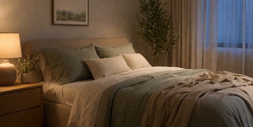
Blue – the most calming colour for better sleep
Blue is the shade most associated with quality rest, especially in dusty, powdery or slate versions. It lowers the visual energy of a room and pairs well with white, cream, oak or warm grey furniture. Our bedroom range at Dako includes beds, wardrobes and chests in colours like White Oak, Grey and Navy Blue, which sit comfortably alongside a soft blue wall.
Green – a natural and restful choice
Muted green works because the eye reads it as nature, which the brain associates with balance. Sage, olive and soft eucalyptus tones pair well with wooden bedroom furniture and warm textiles. One feature wall is fine; four can tip the room towards heavy. Green is a good pick if blue feels too cold.
Neutral tones – soft and soothing bedroom colours
Neutrals are the safest option and easiest to live with over time. Warm beige, oatmeal, stone and soft greige create a quiet backdrop that lets bedding do the work. Pure brilliant white can feel sharp in morning light, so lean slightly warm.
Neutral palettes work best when you vary texture and tone:
- Warm beige walls with a cream bedframe and oatmeal bedding
- Oak-toned wardrobes paired with chalky white walls and linen curtains
- Soft greige with a graphite headboard for quiet contrast
- Mushroom tones with warm wood and a darker rug to ground the room
A neutral base ages well - shift the mood with bedding and cushions, no repainting needed.

What is the most relaxing colour for a bedroom?
Soft, dusty blue tops the ranking - the shade named across sleep studies as the one people rest most soundly in. It reads cool without feeling cold, especially paired with warm wood and cream textiles. Think chalky sky blue rather than primary or turquoise.
If blue is not your taste, muted sage green is the next best choice, followed by warm oatmeal and soft greige. Aim for a colour quiet enough that your eye stops noticing it.
Quick tip: paint a test patch on the wall facing your bed and check it in both morning and evening light. A shade that looks calming at noon can feel flat after dark.
Colours to avoid before sleep
Some shades work against rest because they signal stimulation to the nervous system. Reds, bright oranges, deep purples and electric brights all fall into this category. They belong in rooms where you want energy - a gym corner, a creative study - not where the goal is winding down at the end of the day.
Red and bright colours
Red raises heart rate and visual arousal - the opposite of what a bedroom needs. It is one of the fastest colours for the brain to register, making it harder to settle. Deep burgundy or terracotta can work as small accents, but full red walls keep the room humming after the lights are off.
Dark and overstimulating shades
Very dark colours are trickier than they look. A deep charcoal or moody navy can feel cocooning in good light, but in small rooms they start to feel heavy. At Dako, our bedroom pieces come in colours like White Oak, Cream, Grey and Graphite, which help balance a darker feature wall.
Build a bedroom that actually helps you sleep
The right wall colour is only half the job - restful bedding and calm wood tones do the rest. Start with the walls, then coordinate everything else in the same quiet family. Keep patterns low-key, pick soft cotton and linen textiles, and stick to two or three wood tones across beds and wardrobes rather than mixing five. Browse our bedroom furniture sets and coordinate a palette that keeps the room quiet from bed to wardrobe!
Explore more topics:
Author: Dako Furniture Team