Bedroom storage can completely change how a room feels, depending on color choices made during selection. Many homeowners don't realize how much wardrobe colours impact overall bedroom looks and atmosphere. The right shade creates harmony with existing décor while making room proportions and lighting work better. Understanding color basics helps create bedrooms that feel both beautiful and functional for daily life.
Most popular wardrobe colours
Color trends in bedroom furniture keep changing, though certain shades stay popular across different design movements and what people actually prefer. The most successful wardrobe paint colours balance timeless appeal with contemporary relevance, ensuring pieces remain attractive for years without looking outdated. Modern manufacturing allows for way more color options than were available before.
Understanding why certain colors stay popular helps homeowners make decisions that provide satisfaction over time, rather than following trends that disappear quickly.
White wardrobes – timeless and versatile
White remains the most popular choice for bedroom storage due to its versatility and light-enhancing properties that work in virtually any space. This classic shade goes with all décor styles while making rooms feel larger and brighter than they actually are, working particularly well in small bedrooms where space feels tight. The clean appearance creates neutral backgrounds that let other bedroom elements become focal points, though white shows dust and fingerprints more than darker alternatives.
Grey wardrobes – modern and stylish
Grey has become a contemporary favorite that offers sophistication without the stark contrast of pure white or dramatic weight of black options. This neutral shade works exceptionally well in modern bedroom designs while providing enough depth to create visual interest. The subtle nature of grey allows for easy coordination with changing bedding or accent colors, with different grey tones ranging from light silvery shades to deep charcoal options.
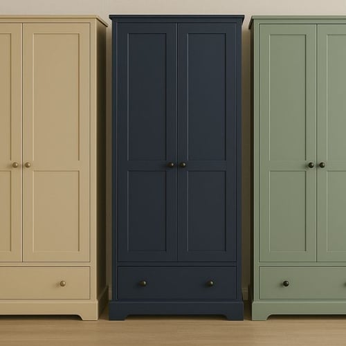
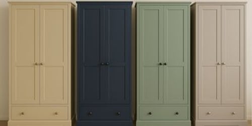
Blue and green wardrobes – bold yet calming
Blue and green shades bring natural tranquility to bedroom environments, while adding personality that neutral tones sometimes lack. Blue wardrobes create serene atmospheres that help with restful sleep, while darker blues like navy provide sophisticated alternatives to black. Green options range from sage and mint to deeper forest tones that bring natural elements indoors.
Black wardrobes
Black storage creates dramatic focal points that work well in larger bedrooms with adequate natural light. This bold choice goes beautifully with metallic accents, white bedding, or colorful artwork while often becoming statement pieces that anchor entire room looks. However, black can make small bedrooms feel cramped, particularly in spaces with limited natural light.
Neutral tones – beige, cream and taupe for warmth
Warm neutral shades create cozy, inviting bedroom atmospheres that feel comfortable and relaxing throughout different seasons. These colors work exceptionally well in traditional bedroom designs where warmth and comfort become primary considerations. Beige and cream wardrobes go beautifully with wood furniture and natural textile selections.
Cream and taupe options bridge the gap between pure white and darker alternatives, providing warmth without creating dramatic contrasts that might feel overwhelming.
How to choose the right wardrobe colour
Selecting appropriate storage colors involves considering multiple factors including room size, natural lighting, existing furniture, and desired atmosphere for the space. Fitted wardrobe colours should work with architectural features while enhancing rather than competing with other bedroom elements. The best choices create environments that feel intentional and well-planned.
Color psychology plays important roles in bedroom environments, where relaxation and rest become primary functions.
Matching wardrobe colours with your room style
Contemporary bedroom designs often favor clean, neutral palettes that emphasize simplicity and uncluttered looks. Well-made wardrobes in white, grey, or black work exceptionally well in these settings while providing the storage functionality needed for modern lifestyles.
Traditional bedroom styles benefit from warmer tones or classic wood finishes that work with period furniture and formal decorating approaches. Built in wardrobe colours in these settings can become focal points that showcase individual style while providing necessary storage functions.
Style-specific color recommendations:
- Contemporary designs - white, grey, black for clean minimalist appeal
- Traditional styles - warm wood tones, cream, beige for classic comfort
- Bohemian rooms - bold blues, greens, or mixed patterns for creative expression
- Industrial themes - black, charcoal grey, raw wood effects for urban edge
- Scandinavian looks - pure white, light grey, natural wood for bright simplicity
Light vs dark colours – which works best in small or large rooms?
Room size significantly influences color effectiveness, with lighter shades generally working better in compact spaces where expansion effects become beneficial. Light colors reflect available light throughout rooms, creating brighter, more open feelings that counteract cramped sensations in smaller bedrooms.
Darker colors work exceptionally well in larger bedrooms, where dramatic effects won't overwhelm available space. These bold choices can actually make oversized rooms feel more intimate when applied thoughtfully. Bedroom wardrobe colours should consider ceiling height alongside floor area when making decisions.
Playing with contrasts and two-tone designs
Two-tone wardrobe designs create visual interest through strategic color combinations that add depth without overwhelming bedroom spaces. Contrasting door colors, interior finishes, or accent details add personality while maintaining harmony with existing room schemes. The trick lies in balancing bold elements with neutral foundations.
Effective contrast techniques include dark doors paired with light interior shelving for added depth, or wood frames combined with painted panels for mixed textures. Matte and glossy finishes work well together for subtle sophistication, while bold hardware colors against neutral wardrobe bodies create focal points. Horizontal color splits deliver modern geometric looks that feel contemporary and fresh.
Wood-effect and painted finishes
Natural wood effects bring warmth and texture to bedroom environments, while providing timeless appeal that goes beyond decorating trends. These finishes work exceptionally well in rooms where natural materials become important design elements throughout the space.
Painted finishes offer unlimited color possibilities while providing smooth, contemporary appearances that work well with modern decorating approaches. Wardrobe colours for bedroom applications should consider durability alongside looks, as storage pieces get frequent use that shows wear over time.
Finish options worth considering:
- Natural oak for warm traditional appeal that ages beautifully over years
- Painted matte surfaces that hide fingerprints while looking modern
- High-gloss finishes that reflect light and create sophisticated appearances
- Textured painted effects that add visual interest while hiding imperfections
- Distressed or weathered looks for vintage charm in casual settings
Transform bedrooms with smart color choices
Successful wardrobe color selection balances personal preferences with practical considerations that affect daily bedroom use and satisfaction over time. The best choices work with existing room elements while enhancing desired atmospheres and spatial effects. Thoughtful color decisions create bedroom environments that feel both beautiful and functional.
Author: Dako Furniture Team