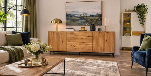
Oak furniture is a timeless choice for a living room. It's sturdy, warm, and full of natural character, from the pale, honeyed tones of light oak to the richer, deeper shades of a darker finish. But once the coffee table, sideboard, or bookcase is in place, a question often follows: what should go around it? In this guide, we'll explore the best colours to pair with oak furniture in the living room!
Pairing colours with oak:
- Warm white, sage and navy - the safest partners for golden oak on walls and fabrics
- Flooring - a slightly different oak tone plus a rug beats an exact match
- Two or three woods - the usual limit for one room
- Brass or black - brass for warm oak, black or silver for cooler and darker oak
- Oak décors at Dako - our sideboards include Oak Sonoma, Oak Canyon and Oak Sterling finishes, and the Oakridge line pairs white with oak
How do oak’s undertones affect your colour palette?
Warm oak calls for warm or muted colours, while pale, cooler oak works best with greys and soft whites. Oak finishes on sideboards and other storage can carry décor names such as Oak Sonoma, Oak Canyon or Oak Sterling. Those names describe a look, and the name alone won’t tell you the undertone. Warm-leaning finishes usually show yellow or orange in the grain, and cooler ones look closer to beige or grey.
Three undertones you’re likely to meet:
- Golden or honey - the most common type, a yellow warmth that pairs happily with cream, sage and terracotta
- Pinkish - typical of red oak, which looks calmer beside cool grey or charcoal than next to warm reds
- Pale and greyish - bleached or limed finishes that suit beige, cream and soft grey
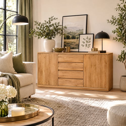
Sonoma oak, for instance, is simply the name of a light oak-effect décor. A sample or a photo taken in daylight shows its undertone far better. The finish shifts the colour too. Oil and solvent-based varnish push oak towards amber. Water-based lacquer keeps it paler and closer to raw timber. As a result, two oak pieces from different makers rarely match exactly, even when both are sold as natural oak.
What colours go with natural oak furniture?
Warm whites, sage, navy and terracotta suit most natural oak, which typically has a golden cast. Build the colour palette around one or two of them and keep the others for smaller accents. Quick tip: paint a large sample card and hold it against the furniture in morning light and again under evening lamps. Both the paint and the oak shift with the light, so one quick look in a shop can mislead.
Cool colours that balance golden oak
Sage green calms golden oak. Olive and deeper greens do a similar job with a little more depth. Navy blue works as a strong, cool backdrop that makes the grain look richer. Both colours suit sofas, cushions or a single painted wall. Navy needs good daylight, though, or a small living room can start to feel heavy.
Warm whites and earthy tones for oak
A white with a yellow or pink base flatters oak, whereas a cold, blue-based white can make golden oak look orange. Cream, stone and greige keep the room light without competing with the wood. White furniture pairs well with oak too. The Oakridge range builds that pairing into each wardrobe, chest of drawers and sideboard. Terracotta and rust add warmth in smaller doses, such as a rug, a throw or a vase.
Can you mix oak with other wood colours?
Oak mixes well with other woods when the tones share an undertone or contrast clearly. Two or three wood tones per room is usually the limit, and more than that can look muddled. Pick each extra wood colour on purpose, because two tones that are almost the same tend to look like a mismatch. Furniture that stands close together deserves the most care.
Four ways to keep mixed woods looking planned:
- Share the undertone - keep warm woods with warm ones and cool woods with cool ones
- Go clearly darker - walnut or a dark-stained wood contrasts well with pale oak
- Separate the pieces - a rug, a painted wall or an upholstered sofa can sit between two woods
- Vary the texture - oak next to oak works when the grain or sheen clearly differs
Choose a floor a shade lighter or darker than the furniture, then add a rug so the two woods don’t merge. Warm beige, honey, taupe and soft grey floors all suit oak. Cool grey floors need warm textiles, such as a wool rug in oatmeal or rust, to balance them.
Which metals and accessories complement oak?
Brass, gold, black metal and soft natural fabrics all complement oak. The right mix depends on how golden or cool the wood looks. Most of these touches are small and easy to change, so they are a low-risk way to test a palette before painting.
Metal finishes that suit oak furniture
Warm oak looks best with brass and gold. Black, silver and chrome work better with darker or cooler oak. Pale limed oak is the exception, as it looks better with matt metals such as aged brass than with high-gloss chrome. Handles, lamp bases and picture frames are the simplest places to bring the chosen metal in. Two metals can share a room if one clearly leads, for example brass lamps with a few black frames.
Textiles and accessories around oak
Linen, wool and bouclé in cream or oatmeal add softness next to the grain. A coffee table is another easy spot to repeat the metal, such as a brass-edged top or slim black legs. Mirrors with thin brass or black frames bounce light onto the wood and help a darker corner. Plants and ceramics in muted clay tones then link the oak to sage or terracotta walls.
How to create a modern living room with oak furniture
Pale walls, simple shapes and a few black accents give oak a modern look, with the wood as the main source of warmth. Living room ideas with oak furniture in this style often use limed oak or light oak effects next to white pieces. The result feels calm and Scandinavian. Light colours help a smaller room feel more open.
Five elements that keep oak looking modern:
- Greige or warm white walls - light enough to feel modern and warm enough to flatter the wood
- Black metal - slim lamp bases, picture frames and cabinet handles
- Simple sofas - low, clean shapes in grey, cream or sage
- White and oak together - furniture that combines both finishes on one piece
- One accent colour - kept to cushions, a rug or a single large print
A common interior design rule, 60/30/10, keeps the balance in check. Roughly 60% of the room goes to the wall colour, 30% to oak and larger furniture, and 10% to one accent. Navy suits that last share well, because it contrasts with golden oak and adds no extra warmth. Swap the accent each season if you like, as cushions and prints cost far less than repainting.
How to style oak furniture in a traditional living room
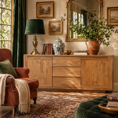
A traditional room brings out oak’s honey tones with richer colours such as terracotta, burgundy, deep green and cream. Brass, heavier fabrics and a few darker wooden pieces complete the look. Oak can also run a shade deeper here than in a modern room.
Wall colours for a traditional oak living room
Cream or a soft warm white on the walls lets burgundy and terracotta work as accents in rugs and curtains. Deep green on one wall gives golden oak a rich backdrop. In north-facing rooms, choose the warmer version of each paint, because cool daylight dulls both the walls and the wood.
Fabrics and display pieces for a traditional oak room
Velvet, wool and patterned rugs in warm reds or greens give a traditional room its weight. A glass-fronted display cabinet in darker oak adds depth and a home for china or books. An armchair in bottle green or rust sits comfortably beside an oak sideboard. Repeating the warm metal in brass lamps and frames ties the whole room together.
Your oak’s undertone sets the whole palette
Walls, floors, fabrics and metals all face the same test: do they flatter the undertone your oak already has? Dako offers more than ten sideboards. One that echoes your oak’s undertone, or gives it a gentle contrast, will fit the palette you have already built.
Author: Dako Furniture Team